Useful Data In Need of a Usability Upgrade
The engineers I work with often refer to data organized in tables. I know this continues to be true in digital products because the webpage with an old HTML table for weight and volume equivalents of liquid oxygen consistently attracted traffic.
But the old-school HTML table was not a good way to present data on all sizes of screens, and the interface needed to be better aligned with best practices in usability.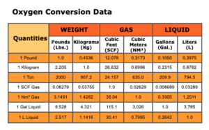
Focusing on Standard Heuristics of User Experience Design
According to Usability expert Jacob Nielsen, the second principle, or heuristic, is “Follow real-world conventions, making information appear in a natural and logical order.”
Since my visitors were accustomed to seeing data in tables, it was essential to keep the data in tabular form but adapt it so that it was accessible on screens of all sizes.

Simplifying the Design to Satisfy the Minimalist User Experience Heuristic
To freshen the table design, I removed the solid black outlines around the “cells.” I brought down the brightness of the table backgrounds and used fewer colors.
The word “Quantities” seemed vague and unnecessary, so I eliminated it and added an equal sign to each original unit of measure instead.
Using Flexbox to Create Tables that Rearrange Themselves
Flexbox is a CSS module. Flexbox sets parent containers that can resize and rearrange the child objects inside. It is generally intended for small-scale layouts like this table. It was the perfect solution— on wider screens, the conversion data would read left to right. On smaller screens, the data was a single column and could be read top to bottom.
I couldn’t simply reproduce the current table as a flexbox grid. There was no practical way to keep data in columns like “Gallon” or “Liter” on a small screen, so the equivalent values had to be labeled with the unit of measure, like Gal. or L.
Then I rearranged all the equivalent values in relationship to 1.0 units of each system of measurement, 1.0 Gallons, 1.0 Liters, 1.0 Pounds, etc.
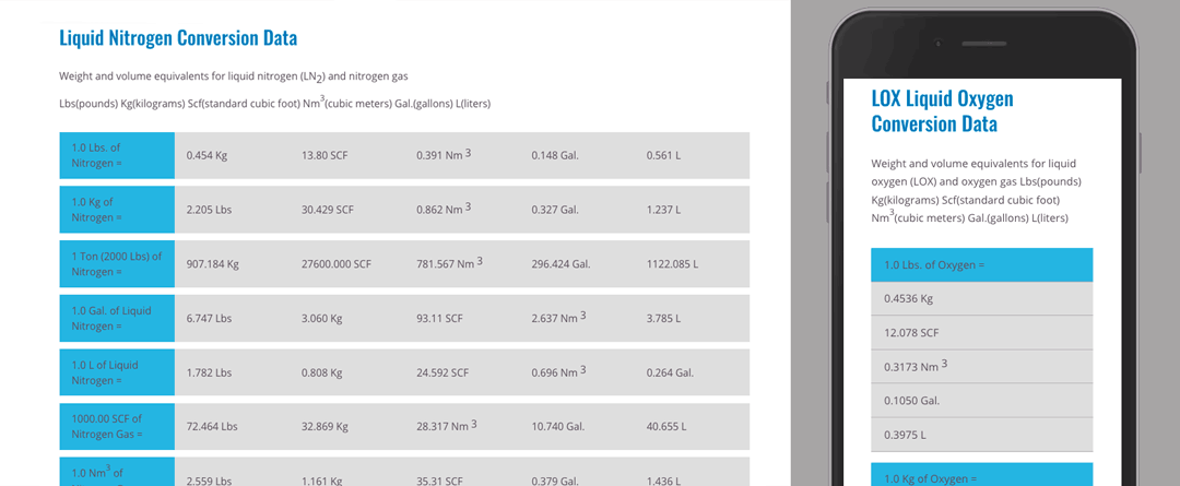
The chart has become a popular landing page, I’ve made another version for converting liquid nitrogen.